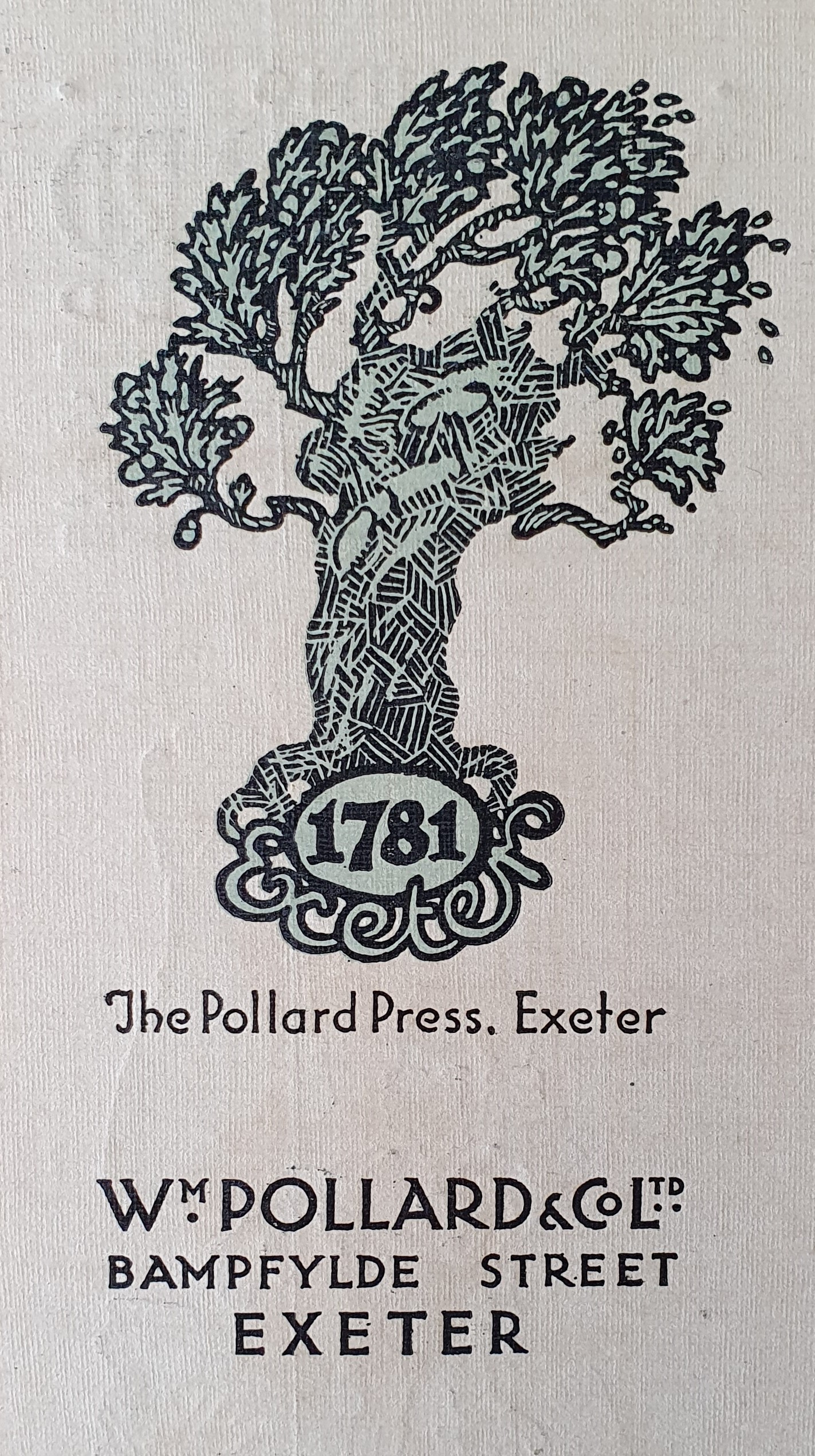
From 1881, marketing material produced by Pollards began to carry the motif of a Pollarded Oak, rooted in Exeter, and to promote 1781 as the date when the family established itself in printing. The logo has of course been modernised several times since then. Most recently, the tree has taken the form of a more abstract network. This conveys a new message. Print has always enabled the distribution of information from a centre to many other points. With new technologies, communication can also seamlessly roll back to the centre – thus offering exceptional integration even with complex organisations. Many of Pollards’ contemporary, multi-channel ‘solutions’, including the market-leading brandhub360, make use of such technology to improve efficiency in procuring print, mailing or other products on behalf of customers.
The original Pollards logo, 1881.
Image Gallery
Click image to enlarge
Finger on the pulse
SOCIALS

All rights reserved © 2024 William Pollard and Company Limited.
Pollards, Pollards Print and brandhub360.com are trading names of William Pollard and Company Limited (Registered in England No. 65337).